If you dream about swanky bathroom remodels that you find in the pages of magazines and home decor sites, turn that fantasy into reality. Most luxe “afters” had embarrassing “befores.” If you have a dark, small, or boring bathroom, see how you can add light, color, or little touches that can turn your washroom into a refreshing spa retreat.
Here are 11 awesome before and after bathroom remodels.
-
01
of 22Before: Dark and Dreary
Kate Arends, the founder of lifestyle blog Wit & Delight, had a decidedly dreary and uninspiring space in her Tudor-style cottage in St. Paul, Minnesota. See how she turned it around.
Continue to 2 of 22 below. -
02
of 22After: Bright and Cheery
With the help of quartz countertop maker Cambria and its White Cliff design, Kate turned her bathroom into a charming, attention-worthy space. The colorful walls are Hygge & West Otomi wallpaper in turquoise. The plumbing fixtures are from Delta’s Trinsic Collection.
Continue to 3 of 22 below. -
03
of 22Before: Bland and Boring
Kristi from the design blog Addicted 2 Decorating had a dull hallway bathroom. She ripped out tile, mortar, wood, and glass, filling 39 contractor bags that went straight to the landfill. The window had originally been an outdoor window, but with a home extension, it now opened to another room.
Continue to 4 of 22 below. -
04
of 22After: Modern Makeover
With the bathroom walls and floor open, Kristi began this bathroom remodel, a case study in DIY. She accomplished 90% of the remodel by herself, only using the help of a plumber, and filled in the useless window.
15 Ideas For Bathroom RemodelingContinue to 5 of 22 below. -
05
of 22Before: Outdated Art Deco
One of homeowner Alice Dubin’s friends said that it would be “a crime against Los Angeles” if she renovated her 1930s art deco-era bathroom. But her friend did not have to live with the “stinky plumbing and cracked tile,” Alice said.
Continue to 6 of 22 below. -
06
of 22After: Vintage-Inspired
Alice gutted the bathroom, but did a sensitive remodel. She retained the feel of the original while functionally updating it. The result is a light-filled bathroom with vintage-inspired floor tiles, subway tile, a Caesarstone tub and countertops, a frameless shower, and tons of other fantastic touches. Alice calls her remodeled bathroom “a respectful upgrade.”
Continue to 7 of 22 below. -
07
of 22Before: Functional but Dated
When Re-Bath of Illinois remodeled this bathroom, they had to transform a fully functioning bathroom from drab and dated to a thing of beauty.
Continue to 8 of 22 below. -
08
of 22After: Lighter and More Open
Re-Bath of Illinois made the bathroom feel airier and lighter by switching out the old pre-fabricated stall-style shower with a frameless glass shower. Frameless showers allow a maximum of light to pass through—a bonus for small spaces.
Continue to 9 of 22 below. -
09
of 22Before: Seventies Style
When TrendMark, Inc. renovated this bathroom, they confronted a space that was stylistically too busy, cramped, and imposing. This room needed a style intervention and significant changes.
Continue to 10 of 22 below. -
10
of 22After: Bright and White
Trendmark revamped this bathroom from floor to ceiling, installing white subway tiles and a frameless glass shower. One unexpected but welcome spot of color comes from the vintage stained glass window insert. A cheerful paint scheme completes the look.
Continue to 11 of 22 below. -
11
of 22Before: Too Much White
Jen Pinkston from decor blog The Effortless Chic thought her bathroom lacked color, to put it mildly. White upon white with gold touches was in fashion during the 1980s and 1990s. She said it was “so much white and not in a good way.”
Continue to 12 of 22 below. -
12
of 22After: Color Upgrade
Jen added sorely-needed color to her master bath remodel with blue hexagon tile from Fireclay Tile and a runner from Lulu and Georgia.
Continue to 13 of 22 below. -
13
of 22Before: Old and Outdated
This “before” bathroom in a two-story 1930s row house in San Francisco featured tile with an unusual shade of green. This bathroom needed a redo that would not break the bank.
Continue to 14 of 22 below. -
14
of 22After: Remodel on a Budget
This remodel cost well under $5,000. One way to do a bathroom cheaply is to purchase stylish but cost-effective building materials. This tile is Daltile Rittenhouse Square 3″ x 6″ white tile from Home Depot.
Continue to 15 of 22 below. -
15
of 22Before: Unfinished Basement
A dark, scary basement bathroom needed a lot of help to make it habitable. Homeowner Michael Groman had a couple of things going for him. It was in a large, open area in the basement, and nothing needed demolition.
Continue to 16 of 22 below. -
16
of 22After: Completed Bathroom
Groman punched windows into the basement walls to add natural light to his new bathroom. A slipper tub turned this utilitarian bathroom into a place to relax and luxuriate.
Continue to 17 of 22 below. -
17
of 22Before: Not so Pretty in Pink
Classic flamingo-pink tile from the 1950s was not this owner’s style, so they hired Sonnenburg Builders to eradicate the pink and update the bathroom.
Continue to 18 of 22 below. -
18
of 22After: Warm and Contemporary
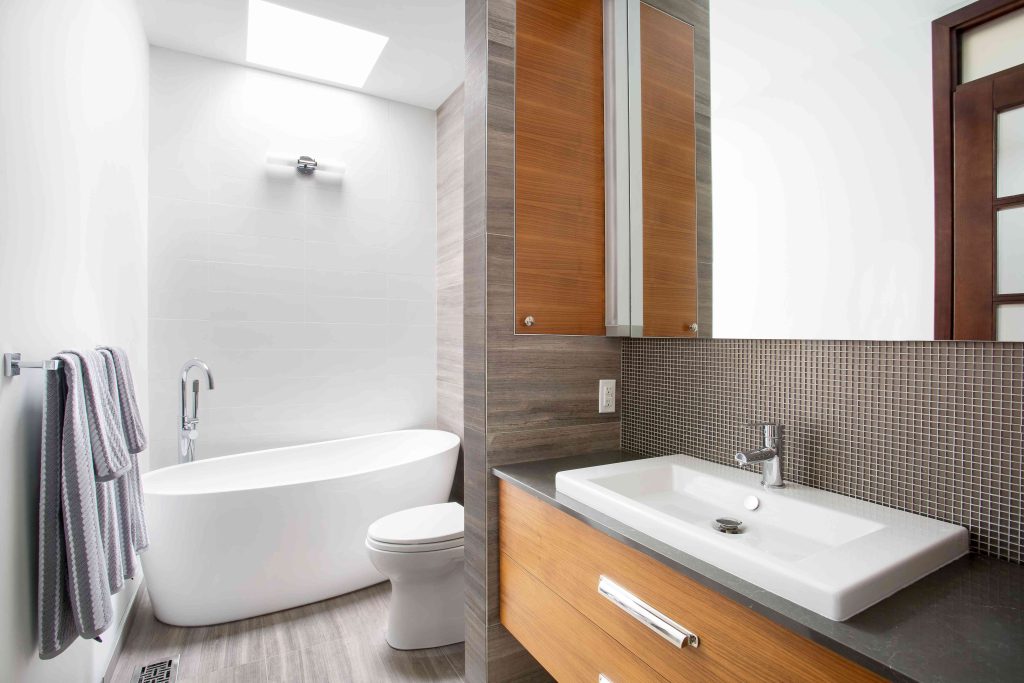
The bathroom got some significant warming touches with light-colored natural wood cabinets, gray countertops, an under-mounted sink, and a large mirror.
Continue to 19 of 22 below. -
19
of 22Before: Stuck in the 50s
This century-old house had an impressive vintage style. Unfortunately, the bathroom did not match the home’s distinctive style.
Continue to 20 of 22 below. -
20
of 22After: Natural and Traditional
The owner brought in Morris Black Designs, a Pennsylvania design firm. They completely redid the bathroom and added a frameless glass wall shower with multiple showerheads. The natural stone shower wall is a nod to the house’s 100-year-old past and its extensive stonework.
Continue to 21 of 22 below. -
21
of 22Before: Blue and Blah
The time when blue bathrooms were in fashion is over. Allison and Jovito Pagkalinawan’s century-old Brooklyn brick row house deserved better. Blue didn’t feel right for the bathroom, nor was it period-appropriate.
Continue to 22 of 22 below. -
22
of 22After: Fresh Period Piece
Allison and Jovito’s bathroom was small—a mere 36 square feet. White reflects more light than any other color and makes small spaces feel more abundant, so they chose white as the dominant color. To align with their home’s period (1910), they decided on subway tiles for the entire bathroom, a clawfoot bathtub, and a pedestal sink. Gleaming chrome towel bars and fixtures dance with light. The result is a comfortable, fresh bath remodel that honors their home’s history.
Read the full article here
