A laundry room makeover can make a big difference for how you feel about having to do the laundry. Who wants to fold socks in a drab room?
Here are 10 before and after laundry room remodels to inspire you.
-
01
of 10Before: Small, Windowless, and Cluttered
This laundry room transformation from Elsie Larson of A Beautiful Mess shows what a difference just a lick of bold paint can make.
After: Fresh Forest Green
Elsie Larson of A Beautiful Mess chose to saturate the walls in forest green paint that adds a fresh feel and provides contrast to make white appliances, ceiling, and window paint and added shelving pop.
Elsie says that the kitchen and laundry room had an open door that felt a bit too exposed, so she chose to add a veil of privacy in the form of a beaded curtain. Instead of a door, which would have had to swing into the kitchen to open, it adds interest and preserves an easy flow from room to room. “It felt a little unconventional to me,” she says,”but the function worked so well that I went for it anyway.”
Continue to 2 of 10 below. -
02
of 10Before: Small, Windowless, and Cluttered
For his first stand-alone laundry room makeover, interior designer Orlando Soria took on this small, windowless space next to a family of seven’s kitchen that doubles as a food pantry. “The room was neither functional nor aesthetically pleasing before,” Soria says. With a washer and dryer stacked to save space that meant there was no place to fold laundry or house a laundry basket. Soria says his mission was to create a “pretty, soothing” room where the family could “do laundry in peace.”
After: Streamlined and Sleek
Orlando says he learned some important lessons from the laundry room makeover. “In a small space that lacks personality, go bold with wall color,” he says, in order to give a dark space vibrancy and personality. Here Soria chose Annapolis Green by Benjamin Moore. The interior designer also notes that adding counter space to create an area to fold laundry is “crucial to the room’s functionality.” Since this particular laundry room doubles as a food pantry off the kitchen, he chose locally sourced walnut for open shelving lined with attractive storage containers to hide clutter.
Continue to 3 of 10 below. -
03
of 10Before: Drab and Boring
Thalita Murray transformed this drab, boring and underutilized space into a beautiful oasis for the most mundane of tasks.
After: Pretty in Pink
xFor this striking laundry room makeover, Thalita Murray moved and painted the original cabinetry; added shelving in between the cabinets to create a custom built-in look; created a countertop on top of the machines; and added a place to store laundry baskets.
She painted cabinets in Lichen by Fusion Mineral Paint and walls in Peach Rose by Behr. She also installed a farmhouse sink and added cheerful wallpaper with a lemon motif (Lovely Lemons by Walls Need Love).
Decorative touches include a faux fiddle leaf fig from Afloral, a letterboard, a large clock, and a braided jute rug to keep bare feet warm while socks are in the wash.
Continue to 4 of 10 below. -
04
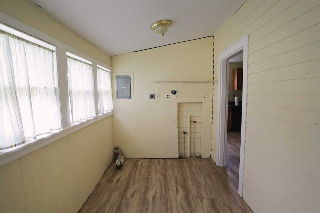
of 10Before: Converted Exterior Porch
The laundry room is often the smallest room in the house, but this makeover from Jenna Sue Design, which took an exterior porch turned laundry room to the next level shows that even the most modest spaces can deliver great impact with well thought out design. “The size and configuration certainly limits the potential in here, but I was determined to make the most of it on a small budget and time frame,” says Jenna Sue.
After: Pretty and Functional Laundry Room
Floors became the focal point for this dramatic makeover from Jenna Sue Design with a whimsical custom penny tile design that she created and refined in Photoshop for weeks until she got it right. She lightened up the dark wood ceiling with HGTV Home by Sherwin Williams Softened Green to maintain a light and airy earthy feel, introduced butcher block counter top shelving and botanical wallpaper for a touch of the organic, added dark modern appliances and a mix of open and closed storage.
How To Install Butcher Block CountertopsContinue to 5 of 10 below. -
05
of 10Before: Cramped, Dated, and Sad
“There is something about a smaller space that gives me a bit more confidence to step outside of my comfort zone,” says Claire Wainwright from The green eyed girl, “and the utility room was the perfect room to do exactly that.” Normally a fan of all-white interiors, she says she was hoping to up the wow factor and include a darker color palette.
After: Modern Utilitarian
“I really wanted to test out some dark paint and knew the utility room could take it,” says Claire. “With light coming from both ends of the room, white tiles, and white cupboards already installed, there wasn’t that much wall space to paint so I thought I would just go ahead and give it a go.” She chose Down Pipe by Farrow and Ball, which she says changes with the light, appearing black one hour and green the next (and gray in the photo above). The dark color plays beautifully against the crisp white tiles, sink, and appliances. To ensure the mostly monochromatic room didn’t feel too cold, she added decorative objects, pictures and oak accents like wooden slat blinds on the window.
“The utility room now somehow looks brighter and bigger with the changes,” she says. “It has become a stylish destination rather than a scruffy afterthought and I am so glad I took the risk to go bold and brave!”
Continue to 6 of 10 below. -
06
of 10Before: Dark and Dated
Ashley Wilson from At Home With Ashley took the dark and dated laundry space in her 1905 Victorian Fairview Cottage and did a gut renovation to transform the room. She and her husband tore out and vaulted the ceiling; painted the floor; added shiplap to the ceiling; replaced the unsightly old water heater with a tankless version; added tile and wallpaper; and built a pedestal for the washer and dryer with a folding countertop.
18 Ways to Decorate With ShiplapAfter: Light and Fresh
“I love how wallpaper pulls together a room like nothing else can!” says Ashley. For the dramatic laundry room transformation, she chose a fun pattern that blends traditional and modern aesthetics (Euphemia 5 Wallpaper from Milton & King). “The wallpaper absolutely makes the space,” she says. “I love the circles of botanical art that are inspired by an Australian artist from the early 1900’s!”
Subway tile is a timeless classic that works well in her period house, and she chose gold Schluter for a modern twist, tiling the three walls surrounding the washing machine. “The space feels so clean now with the walls of tile!” she says. “Which seems perfect for a laundry room!” Finally, adding millwork—baseboards, crown molding, shiplap, casing and wainscot cap—gave the room depth and character. “This used to be a porch,” Ashley says,” But with the beautiful trim, it definitely doesn’t feel like one anymore!”
Continue to 7 of 10 below. -
07
of 10Before: Tired and Underwhelming
Bre Bertolini of Brepurposed turned a tired-looking laundry space into a crisp, functional, and decidedly good looking room with this impressive makeover.
After: Crisp White and Navy Blue
For this laundry room makeover from Bre Bertolini of Brepurposed, she painted cabinetry navy blue (Anchors Aweigh by Sherwin Williams) and added an IKON sink from Blanco. “I wanted a pull down since the sink is so big,” she says. “It makes it easier to wash it out and it will be nice for getting out stains.”
Open wood shelving above the washer and dryer and black brackets spray painted in gold for an inexpensive, high end look and an old door slab repurposed as a countertop creates a butcher block effect. Succulents, a letterboard, and a vintage rug add a decorative touch.
Continue to 8 of 10 below. -
08
of 10Before: Cluttered Corner of the Garage
Interior designer Anita Yokota says she battled with a tiny corner of her cluttered garage that served as a makeshift laundry room for a decade before she finally decided to transform the jumbled space.
After: A Dedicated Space That’s Stylish and Functional
Anita decluttered the space, added epoxy flooring, wallpaper, a countertop, a utility sink, and open shelving. She chose a metallic rose gold finish for her washer and dryer, a fiddle leaf fig, wallpaper from Rebecca Atwood, open shelving, and baskets to store laundry essentials such as liquid detergent, dryer balls, and cleaning supplies. “Since transforming my garage into a laundry oasis,” Anita says, “I seriously have been meditating in here while I do a load of laundry.”
Continue to 9 of 10 below. -
09
of 10Before: Lacking Functionality and Style
Jenna Sue of Jenna Sue Design and her husband Brad “created a brand new room from an awkward, cave-like, almost closet space downstairs” in the form of a stylish, functional laundry room. “We came up with a solution to maximize the space by building an alcove for the appliances to be recessed into the wall and also create a separate storage room in the back,” she says. “Everything came out—the floors, ceiling, walls, HVAC, even dirt and rock that had to be excavated to extend the room and allow for a washer/dryer enclosure under the house.”
After: Rustic Farmhouse Touch
“This space was inspired by my vision of what laundry must be like in heaven,” says Jenna Sue of Jenna Sue Design. To turn the dark basement into a dreamy laundry room space, she added a recessed washer and dryer that allowed for the addition of a full wall of cabinets, plus a DIY barn door, floating reclaimed wood shelf, custom butcher block, a farmhouse sink and subway tile. “Removing the ceiling drywall and leaving the joists exposed was a design risk that I wasn’t 100% confident about in the beginning,” says Jenna Sue, “but it’s absolutely one of my favorite things we did. It not only makes the room look and feel so much taller—it brings such personality and interest to the space. I’d do it again in a heartbeat.”
Continue to 10 of 10 below. -
10
of 10Before and After: Space Planning and A Paint Job
This laundry room makeover from Elsie of A Beautiful Mess might not look like a major transformation at first glance, but it involved a major move. Elsie says she wanted to relocate the sink from the minute she saw the room, and to do so required major plumbing work and ripping out part of the ceiling to give her a view of the backyard from the sink. “I feel like this was how it was always meant to be!” she says. “Maybe not the most dramatic before/after of all time, but if you really look the upgrades are all very thought out and practical. I also just love how bright, fresh and clean this room feels now.” She replaced the marble counter top with low maintenance quartz and added a champagne bronze faucet to complete the look.
Read the full article here


